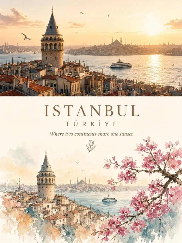
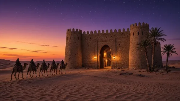
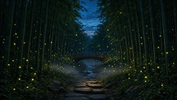
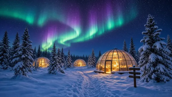
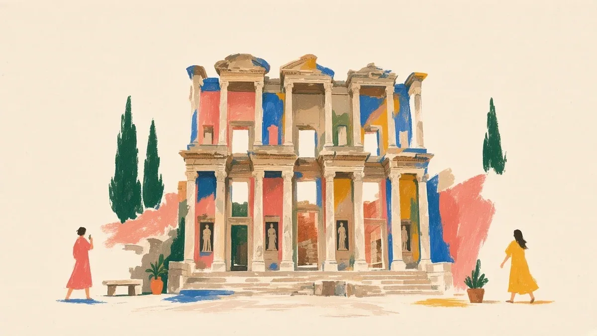
این پرامپت یک کارتپستال شبیه نقاشیهای وسط قرن بیستم میسازد. کاغذ کرم نصف قاب را خالی میگذارد و بنا با چند لکهی آبی، سبز و فیروزهای نشان داده میشود، نه با جزئیات دقیق. دو سه آدم کوچک قرمز و زرد، یک میز یا نیمکت و چند گیاه حس زندگی میدهند.
پیشنهاد میکنیم اول متن را همانطور که هست امتحان کنی و بعد جزئیاتی مثل رنگ، سوژه و مکان را به میل خودت عوض کنی. هر بخش متن برای کنترل یک جزء از نتیجه نوشته شده است.
نمونهی کنار صفحه با یکی از مدلهای روز ساخته شده است. اگر مدل دیگری انتخاب کنی، نتیجه کمی فرق میکند؛ پس اول یک بار امتحان کن و بعد تغییر بده.
برای شروع فقط سوژه و رنگها را عوض کن و ساختار متن را دست نزن. همین ساختار است که نتیجه را منظم و حرفهای نگه میدارد.
 GPT Image
پرامپت کارتپستال نقاشیشدهی یک بنای معروف با فضای خالی زیاد
یک قالب برای نقاشی افقی از هر بنای مشهور روی کاغذ کرم، با لکههای رنگی ساده و آدمهای ریز.
پیش از ساخت: نام بنا و شهر را بنویس. بخشهای کروشهدار را هم با جزئیات همان بنا پر کن.
متن کامل پرامپت؛ روی تکههای خطدار بزن تا توضیحش را ببینی
A wide horizontal landscape hand-painted illustration of Eiffel Tower in Paris, France with strong emphasis on negative space and quiet composition. The image features a warm off-white cream paper background that occupies 40-50% of the total canvas, creating generous blank margins and breathing room. The Eiffel Tower is positioned slightly off-center as a calm visual anchor, depicted through simplified [KEY ARCHITECTURAL FEATURES - e.g., "towering structures", "iconic silhouette", "distinctive archways"] with loose, expressive brush strokes. The landmark is suggested through minimal rhythmic marks and abstract color blocks in deep teal, cobalt blue, and forest green, rather than drawing every architectural detail precisely. The composition is sparse and uncluttered: only a few carefully placed elements including 2-3 tiny human figures [DOING TYPICAL ACTIVITY - e.g., "walking", "taking photos", "sitting"] rendered as simple silhouettes in coral red and mustard yellow, one small [CONTEXTUAL ELEMENT - e.g., "cafe table", "bench", "street vendor cart"] with minimal shapes, two or three [NATURAL ELEMENTS - e.g., "potted plants", "trees", "flowers"] in emerald green, and subtle [CULTURAL/ARCHITECTURAL HINTS - e.g., "traditional roof lines", "modern glass panels", "historic columns"]. Large areas of the warm paper background remain completely untouched, especially around the edges and between elements. The style combines mid-century travel poster aesthetics with contemporary [REGIONAL] editorial illustration: elegant, minimal, warm, cultured, and slightly nostalgic. The texture shows loose hand-painted gouache and pastel marks with dry brush strokes, pastel smudges, wax-crayon edges, uneven color patches, imperfect handmade edges, and visible gaps between colored areas. Colors are layered, dry, and tactile with a restrained palette of deep teal, sky blue, coral red, salmon pink, mustard yellow, ochre, terracotta, and small near-black accents, but used sparingly so each color can breathe against the paper. The overall mood is quiet, spacious, relaxed, refined, like a sophisticated [CITY] cultural postcard or handmade art print suitable for premium lifestyle merchandise. The landmark remains recognizable through its essential identity—[DEFINING CHARACTERISTICS]—but the drawing stays airy, calm, poetic, and softly abstract. Strong sense of pause, breath, and refined emptiness with confident use of blank space. No crowded composition, no full-bleed busy background, no photorealism, no glossy digital rendering, no clean vector art, no 3D rendering, no text, no signage, no logos, no readable text.
راهنمای نوشتهی فارسی روی عکس
- «کپی» یا «با همین بساز»؟ «کپی» متن را با همان چیزهایی که در جاهای خالی نوشتی برمیدارد تا هر جا خواستی استفاده کنی. «با همین بساز» ابزار ساخت هوش نو را باز میکند و متن کامل را خودش در کادرش مینویسد؛ فقط دکمهی ساخت را بزن.
- مدل درست را انتخاب کن. GPT Image 2 و نسخههای بعدش (مثل GPT Image 2.5)، Muse Image و مدلهای Nano Banana نوشتهی فارسی را درست و خوانا مینویسند. در ابزار عکس، مدل را از منوی مدل پایین کادر عوض کن.
- تیک «ترجمه نکن» را بزن. وگرنه نوشتهات پیش از ساخت انگلیسی میشود. برای اسم برند و تیتر این تیک از قبل زده شده است.
- کوتاه بنویس. یک تا چهار کلمه بهترین نتیجه را میدهد؛ جملهی بلند احتمال جابهجا شدن حروف را بیشتر میکند.
- همان را بنویس که میخواهی دیده شود. رقمها را فارسی یا انگلیسی، همانطور که باید روی تصویر بیاید، بنویس. نیمفاصله را هم رعایت کن.
- اگر حرفی جابهجا شد، نوشته را کوتاهتر کن یا یک بار دیگر بساز.
از ۲٫۳ اعتبار
- روزی ۲ عکس رایگان بعد از ورود
- هر کلمهاش را پیش از ساخت میتوانی عوض کنی
- ساخت ناموفق = برگشت خودکار اعتبار
 این عکس را ویدیو کن ←