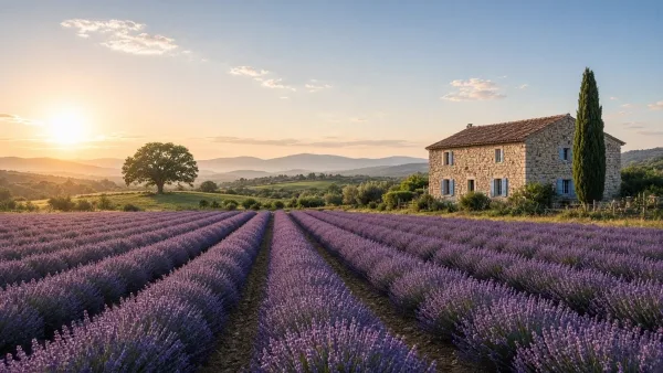
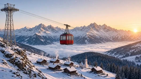
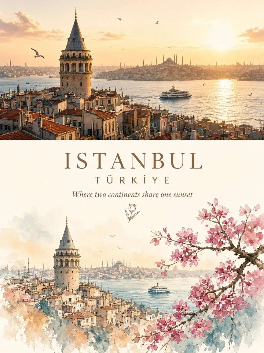
این پرامپت یک پوستر سفر دوقسمتی میسازد: نیمی از تصویر یک نقاشی آبرنگ از مقصد و نیم دیگر عکس واقعی همان جاست. هدف نشاندادن تبدیل عکس به آبرنگ است و پوستر برای گردشگری و تبلیغ مقصد کاربرد دارد.
برای شروع فقط سوژه و رنگها را عوض کن و ساختار متن را دست نزن. همین ساختار است که نتیجه را منظم و حرفهای نگه میدارد.
پیشنهاد میکنیم اول متن را همانطور که هست امتحان کنی و بعد جزئیاتی مثل رنگ، سوژه و مکان را به میل خودت عوض کنی. هر بخش متن برای کنترل یک جزء از نتیجه نوشته شده است.
نمونهی کنار صفحه با یکی از مدلهای روز ساخته شده است. اگر مدل دیگری انتخاب کنی، نتیجه کمی فرق میکند؛ پس اول یک بار امتحان کن و بعد تغییر بده.
 GPT Image
پرامپت پوستر هنری آبرنگ سفر: دو بخش (عکس به آبرنگ)
پوستر عمودی ۴:۵ که یک مقصد را دو بار نشان میدهد: یک بار آبرنگ و یک بار عکس.
پیش از ساخت: نام شهر یا کشور را بنویس.
متن کامل پرامپت؛ روی تکههای خطدار بزن تا توضیحش را ببینی
Create an exceptionally beautiful vertical 4:5 travel-art poster featuring Isfahan, Iran, presented as a sophisticated two-part visual collage. The composition must have two distinct but harmoniously connected sections. TOP SECTION — THE REAL WORLD Use the actual destination as the primary visual reference. Create a breathtaking photorealistic travel photograph of Isfahan, Iran. Preserve its recognizable architecture, landscape, landmarks and geographical identity. Capture beautiful natural lighting, realistic colours and atmospheric depth. Include a few subtle human elements, boats, streets or local details where appropriate. Keep the composition cinematic, clean and visually immersive. This section should feel like a photograph taken during a beautiful journey. MIDDLE SECTION — THE EDITORIAL TRANSITION Create an elegant transition between photography and illustration. Add the destination name in beautiful, sophisticated typography. Include the country name in small uppercase lettering. Add a short poetic travel-inspired tagline. Use delicate hand-drawn decorative elements, tiny botanical details or a minimal location emblem. Maintain generous white space and a refined editorial layout. BOTTOM SECTION — THE WORLD REIMAGINED AS ART Transform the same destination into a beautiful minimalist hand-painted illustration. Recreate the recognizable landmark or scenery from the upper photograph. Use delicate watercolor washes, expressive gouache brushwork and subtle ink outlines. Simplify the architecture and surroundings into an elegant artistic composition. Retain the destination’s signature colours, shapes and distinctive features. Add a few charming details such as tiny boats, flowering branches, little figures, birds or local elements. Use soft pastel shades, muted colours and carefully placed vibrant accents. Allow some watercolor textures and painted edges to fade naturally into the white background. The lower illustration must be an artistic interpretation of the SAME location shown above, not an unrelated scene. ART DIRECTION Premium illustrated travel magazine aesthetic. Contemporary minimalist editorial design. Beautiful balance between photography and fine art. Delicate watercolor and mixed-media textures. Sophisticated typography and generous negative space. Soft, harmonious colour palette. Elegant, clean and collectible poster appearance. FINAL COMPOSITION Vertical 4:5 poster. Upper half: approximately 50% photorealistic destination photography. Lower half: approximately 50% minimalist watercolor illustration. A subtle, elegant transition between both worlds. Destination name clearly visible and beautifully typeset. No creator watermark, no unnecessary text, no clutter. DESTINATION TITLE: [CITY / LANDMARK] COUNTRY: [COUNTRY] TAGLINE: [SHORT POETIC TRAVEL QUOTE] The final artwork should communicate one beautiful idea: experience the destination in reality above, then discover its artistic soul below.
راهنمای نوشتهی فارسی روی عکس
- «کپی» یا «با همین بساز»؟ «کپی» متن را با همان چیزهایی که در جاهای خالی نوشتی برمیدارد تا هر جا خواستی استفاده کنی. «با همین بساز» ابزار ساخت هوش نو را باز میکند و متن کامل را خودش در کادرش مینویسد؛ فقط دکمهی ساخت را بزن.
- مدل درست را انتخاب کن. GPT Image 2 و نسخههای بعدش (مثل GPT Image 2.5)، Muse Image و مدلهای Nano Banana نوشتهی فارسی را درست و خوانا مینویسند. در ابزار عکس، مدل را از منوی مدل پایین کادر عوض کن.
- تیک «ترجمه نکن» را بزن. وگرنه نوشتهات پیش از ساخت انگلیسی میشود. برای اسم برند و تیتر این تیک از قبل زده شده است.
- کوتاه بنویس. یک تا چهار کلمه بهترین نتیجه را میدهد؛ جملهی بلند احتمال جابهجا شدن حروف را بیشتر میکند.
- همان را بنویس که میخواهی دیده شود. رقمها را فارسی یا انگلیسی، همانطور که باید روی تصویر بیاید، بنویس. نیمفاصله را هم رعایت کن.
- اگر حرفی جابهجا شد، نوشته را کوتاهتر کن یا یک بار دیگر بساز.
از ۲٫۳ اعتبار
- روزی ۲ عکس رایگان بعد از ورود
- هر کلمهاش را پیش از ساخت میتوانی عوض کنی
- ساخت ناموفق = برگشت خودکار اعتبار
 این عکس را ویدیو کن ←