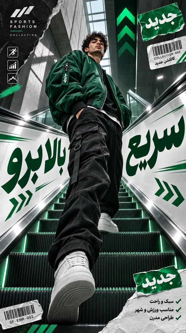
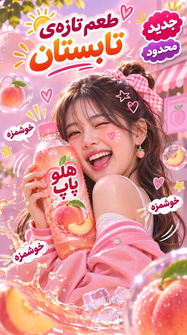
این پرامپت از مدل میخواهد مثل یک مدیر هنری شبکههای اجتماعی فکر کند. کارش در چند فاز نوشته شده: اول چارچوب مفهومی («شورش کنترلشده»)، بعد مدل و عکاسی، بعد لباس و بقیهی عناصر طراحی. نتیجه یک کولاژ پرانرژی است با لبههای پاره، بافتهای لایهای و رنگهای جسور که هنوز همخوانی برند را حفظ میکند. برای ساخت پست و تبلیغ برندهای جوان و مدرن مناسب است.
برای شروع فقط سوژه و رنگها را عوض کن و ساختار متن را دست نزن. همین ساختار است که تصویر را منظم و حرفهای نگه میدارد.
پیشنهاد میکنیم اول متن را همانطور که هست امتحان کنی و بعد جزئیاتی مثل رنگ، لباس و نوشته را به میل خودت عوض کنی. هر بخش متن برای کنترل یک جزء از تصویر نوشته شده است.
 GPT Image
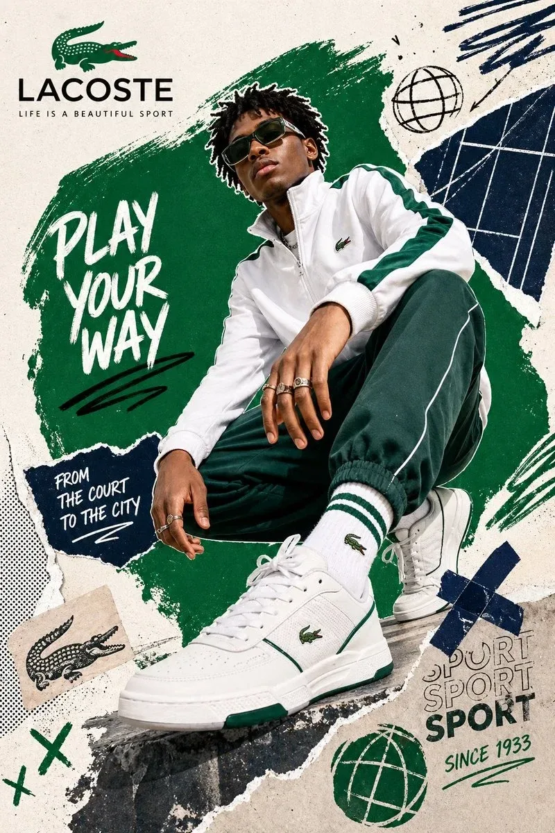
پرامپت کولاژ دیجیتال برند برای جوانها با قاب بینظم
ترکیب عکس مد با طراحی پر هرجومرج؛ لبههای پاره، بافتهای لایهای و رنگهای گستاخ برای کمپین اینستاگرام.
پیش از ساخت: نام برند را در جای خالی بنویس. بقیهی فازها قالب کار هستند.
متن کامل پرامپت؛ روی تکههای خطدار بزن تا توضیحش را ببینی
NOVA. Act as a Social Media Art Director and Digital Collage Artist specializing in bold, youth-oriented brand content for Instagram and digital campaigns. PHASE 1: CONCEPTUAL FRAMEWORK Create a dynamic digital collage that merges fashion photography with graphic design chaos. This is controlled rebellion – a composition that feels spontaneous and energetic while maintaining brand coherence. The aesthetic is anti-polished: torn edges, layered textures, hand-drawn elements, and bold color blocking that screams confidence and movement. PHASE 2: MODEL & PHOTOGRAPHY - Subject: One model (diverse casting, age 18-30) in a dynamic, confident pose - Pose Energy: 80% attitude, 20% natural – sitting, jumping, mid-motion, or power stance (avoid static standing) - Outfit: Street style/athleisure that aligns with [BRAND NAME] aesthetic – casual but styled - Hero Product: Feature 1 signature [BRAND NAME] product prominently (sneakers, bag, apparel) – this is the visual anchor - Photography Style: Editorial fashion cutout – model extracted from background with clean edges - Camera Angle: Slight low angle to empower subject (hero perspective) - Crop: Full body or 3/4 body showing hero product clearly - Background Removal: Model cut out cleanly for layering over collage elements PHASE 3: COLOR BLOCKING FOUNDATION - Primary Color Blob: Large organic shape (40-60% of composition) in bold, saturated brand color behind/around model - Shape Style: Irregular, hand-painted aesthetic – think Photoshop brush strokes or torn paper texture (NOT perfect geometric shapes) - Color Selection (Autonomous): Choose 1 hero color from [BRAND NAME] palette: - Texture: Visible brush strokes, grain, or subtle noise (15-25% opacity) – avoid flat digital fills - Placement: Blob positioned to frame model without obscuring key product details PHASE 4: GRAPHIC ELEMENTS LAYER Add 3-5 abstract graphic elements scattered across composition: - Element Types: - Color Palette: Use 2-3 accent colors total (main blob color + 1-2 contrasting tones from brand palette) - Placement: Asymmetric scatter – top-left and bottom-right zones primarily (avoid center crowding) - Scale: Mix small (5% of canvas) and medium (15% of canvas) elements – nothing overpowering - Aesthetic: Analog/handmade feel – imperfect circles, rough edges, visible texture PHASE 5: TYPOGRAPHY INTEGRATION - Brand Logo: Clean [BRAND NAME] logo placed in upper-left or upper-right quadrant (10-15% of width) - Slogan/Tagline: If [BRAND NAME] has an iconic slogan, integrate it using: - Supporting Copy: Optional 1-line descriptor (e.g., "A MOMENT OF YOUR STYLE") in smaller uppercase sans-serif - Type Treatment: Mix of aligned and slightly rotated text (2-5° angles) for dynamic energy - Hierarchy: Logo largest → Slogan medium → Copy smallest PHASE 6: TEXTURE & BACKGROUND - Base Layer: Off-white or light gray textured background (NOT pure white) - Texture Options (Autonomous selection): - Color: RGB 245-250 (near-white with warmth) – maintains brightness while adding depth - Treatment: Texture should be felt, not seen – enhances tactility without competing with foreground PHASE 7: COMPOSITION RULES - Layout: Asymmetric balance – model off-center, graphic elements counter-balance - Breathing Room: 15-20% negative space (textured background visible) to prevent claustrophobia - Layering Order: Background texture → Color blob → Graphic elements → Model (cutout) → Typography top layer - Focal Point: Model + hero product = primary focus (60% visual weight), graphics support (40%) - Movement: Diagonal lines and angled elements create directional flow (top-left to bottom-right or vice versa) PHASE 8: BRAND INTELLIGENCE (AUTONOMOUS) Autonomously adapt composition based on [BRAND NAME] personality: - Streetwear/Sportswear (Nike, Adidas, Supreme): - Luxury Streetwear (Balenciaga, Off-White, Gucci): - Beauty/Lifestyle (Glossier, Fenty, Skims): - Tech/Modern (Apple, Tesla, Beats): PHASE 9: SOCIAL MEDIA FOOTER (OPTIONAL) - Bottom Strip: Clean white or light gray bar at bottom 8-10% of frame - Content: Social media handles (Instagram, Facebook, Twitter) in small sans-serif - Layout: Three-column grid with platform icons or text handles - Aesthetic: Minimal and professional – contrast with chaotic collage above TECHNICAL SPECS: - Aspect Ratio: 4:5 (Instagram feed) or 1:1 (square social post) - Resolution: 2400x3000px minimum (high-quality for zoom and detail) - Color Mode: sRGB, vibrant saturation (Instagram-optimized) - File Aesthetic: Digital collage that mimics analog craft (Photoshop + hand-drawn hybrid) - Model Photography: 85mm lens, f/2.8, shallow depth of field on original shoot (before cutout) - Style Reference: Nike social campaigns, Spotify wrapped graphics, Gen Z Instagram aesthetics, Hypebeast x streetwear collabs - Mood: Confident, energetic, youthful, authentic chaos, anti-corporate polish
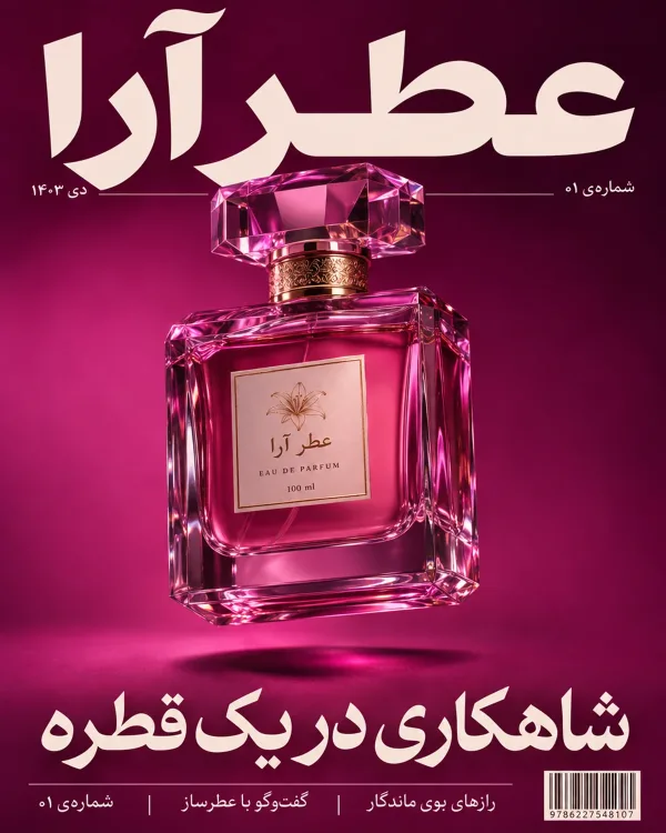
راهنمای نوشتهی فارسی روی عکس
- «کپی» یا «با همین بساز»؟ «کپی» متن را با همان چیزهایی که در جاهای خالی نوشتی برمیدارد تا هر جا خواستی استفاده کنی. «با همین بساز» ابزار ساخت هوش نو را باز میکند و متن کامل را خودش در کادرش مینویسد؛ فقط دکمهی ساخت را بزن.
- مدل درست را انتخاب کن. GPT Image 2 و نسخههای بعدش (مثل GPT Image 2.5)، Muse Image و مدلهای Nano Banana نوشتهی فارسی را درست و خوانا مینویسند. در ابزار عکس، مدل را از منوی مدل پایین کادر عوض کن.
- تیک «ترجمه نکن» را بزن. وگرنه نوشتهات پیش از ساخت انگلیسی میشود. برای اسم برند و تیتر این تیک از قبل زده شده است.
- کوتاه بنویس. یک تا چهار کلمه بهترین نتیجه را میدهد؛ جملهی بلند احتمال جابهجا شدن حروف را بیشتر میکند.
- همان را بنویس که میخواهی دیده شود. رقمها را فارسی یا انگلیسی، همانطور که باید روی تصویر بیاید، بنویس. نیمفاصله را هم رعایت کن.
- اگر حرفی جابهجا شد، نوشته را کوتاهتر کن یا یک بار دیگر بساز.
از ۲٫۳ اعتبار
- روزی ۲ عکس رایگان بعد از ورود
- هر کلمهاش را پیش از ساخت میتوانی عوض کنی
- ساخت ناموفق = برگشت خودکار اعتبار
 این عکس را ویدیو کن ←